

Introduction
Problem & Scope
With the ongoing state of the Covid-19 pandemic, more and more people are struggling to balance their health goals with ever-changing guidelines and shutdowns. Balancing a busy work, school, and social schedule it can be hard to make time or space to cook or eat healthy meals. How might we give users control over their fitness and meal plan goals?
Our Goal was to provide users with a more efficient, informed, and positive way to take control of their health and fitness goals through their nutrition. A majority of physically active users who want to live a healthy lifestyle face the problem of being too busy and not having an all-in-one place to keep track of their exercise goals as well as their nutrition goals. With an abundance of different sources on the internet it can be difficult for users to understand what is a credible source without falling into unhealthy fad diets that will not help them in reaching their desired goals.
My Role: I was the Project Manager, UX Researcher & Designer. I led generative research from user interviews while my colleagues conducted business research. I was responsible for design strategy from greyscale to final prototype, as well as iterating based on usability testing.
Time: 3 weeks
Tools: Figma, Figjam, Miro, google Surveys, Zepelin, Zoom
Methods used: Competitive & Comparative Feature Analysis, Secondary Market Research, User Interviews, Affinity Map, User Persona, User Journey, User Flow, Site Map, Problem Statement, Feature Prioritization, Sketching & Design Studio, Prototyping & Iterating, Usability Testing
Challenge
We wanted to find how we could give a company like peloton a new market to expand to. Peloton mostly focuses on physical fitness, workout equipment, and fitness tutorials. We felt like peloton didn't cover something that is extremely essential for having a healthy body and that was the nutrition aspect. Peloton was missing something crucial and we sought out to give them that solution with PFule.
Project Goals
Individuals are struggling to stick to their health and fitness goals. Users need a better way of visualizing their workout plans and dietary intake. Giving the user a better understanding of what they need to do to achieve their goals would yield better health and fitness results.
Problem statment
"How might we empower users to have control over their nutrition goals in a positive, healthy, and credible way?"
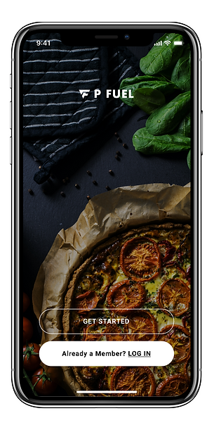
Our solution

Guidance for you nutrition at you fingertips
The Process
Research
Synthesize
Ideate
Deliver
RESEARCH
PHASE
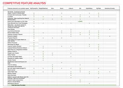
To get started we had to understand Peloton and the market we were looking to break into. Our team created a Business Model Canvas (BMC) to help us visualize the key elements of Peloton business and how they relate. Through understanding Peloton’s business as a whole, we were then equipped to perform competitive research, help define success, and flesh out complexities. A Competitive Matrix was created to determine and serve as a visual representation of our product’s position in the market. We selected several mobile apps where our target consumers may visit to fulfill their needs and ranked them on elements (goals and specialization)that they may consider before downloading. Our team conducted a Competitive Feature Analysis to understand the current features offered on the competitive advantage that other companies have in offering similar or different features. The purpose was to identify all the services available in the market and where we can fill the void. We found a few insights through that round of research but wanted to be sure that our suggestions were firmly backed by the research. After doing business research on Peloton and competitive businesses, our team conducted user interviews with 5 participants to explore the user’s point of view on maintaining a healthy lifestyle. We came up with several open-ended questions that could lead to more insights and/or follow-up questions. From all of this research, we were able to find that there were certain insights and findings that we wanted to focus on.
 |  |  |  |
|---|

Synthesis » Affinity Mapping
After conducting user interviews, our team created an affinity map that we used the takeaways and notable points from our interviews to create sticky notes that we could group and notice themes or trends in responses from our interviewees.
During this process we found that a large majority of our users had very strong feelings about how nutrition impacted their fitness performance. Many of them cited that they preferred to have guidance and often felt lost without a credible source of information that would work for them such as from a nutritionist.
Research findings
Time
With limited time in the day, users need a way to have quick easy meals that keep them away from fast-food options.
Diet Culture
Users need guidance on understanding their caloric intake as something beyond diet culture and using that information to meet their health goals.
Nutritional Guidance
Users value nutritional information from a reputable source. In addition to guidance to keep them motivated and on track with their goals.
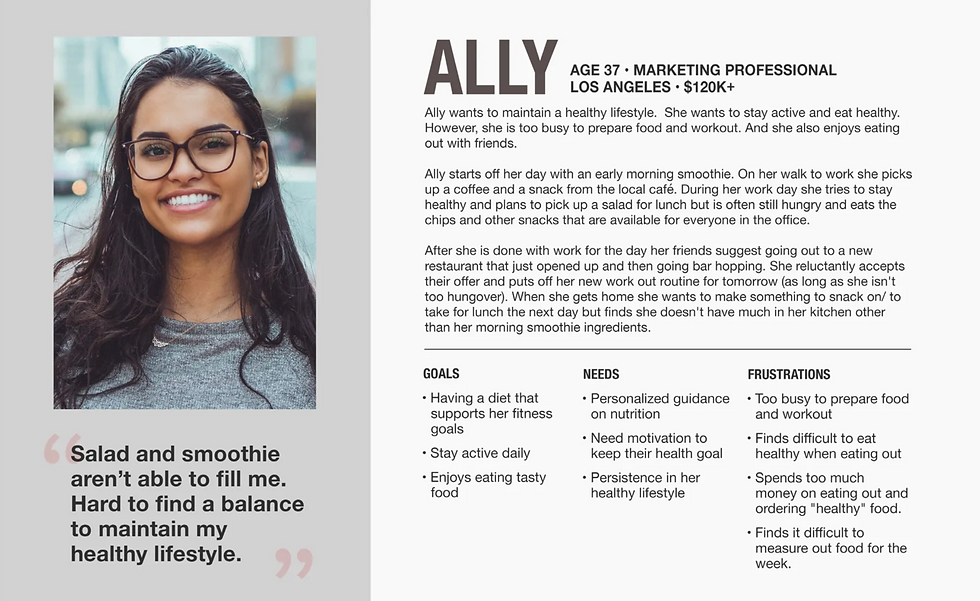
Persona & Journey map
The data we received from the interviews was an essential part of identifying patterns users were experiencing in the real world, We visualized these patterns in our affinity map board, We determined that we had enough data to develop a persona, this persona was to be given a name, age, profession, income, even a short hypothetical summary about herself. It's important to developed a persona to better understand our data collected, this data is essential in determining what users are looking for. The Personas issues will give us a better understanding on how people are handling their diets, workouts, and busy lifestyles.
Journey Map
With our persona, Ally in mind we wanted to map out what a typical day in her life looks like. We started off taking a look at Ally’s daily life and with her goals in mind we were able to map out a scenario that would open up places for opportunities to address her pain points and create a more effective user experience for Ally. Our team found that Ally has her lowest points in the afternoon and night phase. We focused our design to these two phases to help Ally’s needs. Using Miro we mapped out an entire day for Ally from morning through her evening. Starting off by mapping out her User steps and then mapping her highlights and pain points, system touch points, emotional journey and then potential opportunities. Using different colored sticky notes and quotes from our interviews we were able to piece together a journey for Ally.
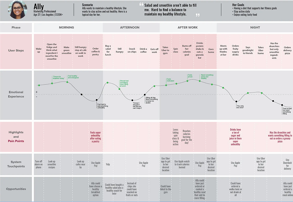
Conclusion & Revised problem statement
-
Ally has trouble picking healthy options when quick unhealthy options are easier to choose or more accessible.
-
Travel to and from places could be included or done as a part of her exercise rather than driving/ paying for an Uber.
-
When going out with friends she doesn’t need to compromise her health but could be led to choose healthier options than sugary/ greasy options.
A majority of physically active users who want to live a healthy lifestyle face the problem of being too busy and not having an all-in-one place to keep track of their exercise goals as well as their nutrition goals. With an abundance of different sources on the internet it can be difficult for users to understand what is a credible source without falling into unhealthy fad diets that will not help them in reaching their goals.
As a result, Ally does not feel like she can keep up a healthy lifestyle with her busy work and social schedule.
"How might we empower users to have control over their nutrition goals in a positive, healthy, and credible way?"
Design Studio: Sketching + Concepting
Our team’s next step was to add all the features we thought would be essential for a mid-fidelity mock-up. We filtered out what features we wanted via our Feature Prioritization & Moscow Map activity. The design studio session was meant for all of our team members to draw out their ideas for each category we needed for our mid-fidelity mock-up. Each team member had the opportunity to pitch their idea for each feature they drew, team members were also allowed to give their feedback about each design that was made. We finished the design studio with one final design that we thought had the best ideas from each team member’s designs.
MOSCOW MAP
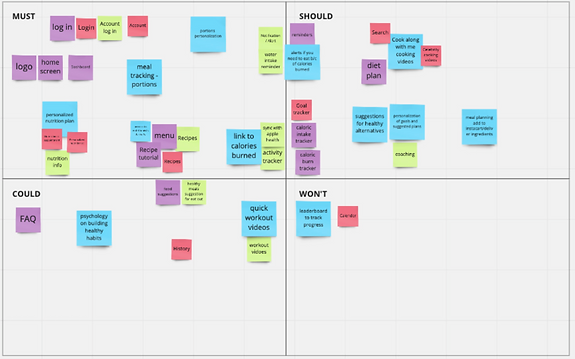
We landed on the following as must haves:
-
Log-in
-
Home screen
-
Nutrition plan/information
-
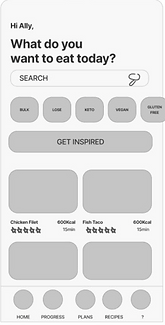
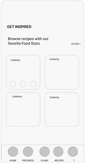
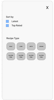
Recipe suggestions and tutorials
-
Activity tracking
-
Calorie tracking
-
Water consumption
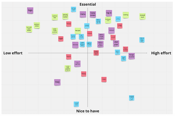
FEATURE PRIORITIZATION MATRIX
-
A majority of our ideas fell into the essential half of the matrix.
-
A few important features were: a logo, log-in screen, and a menu/diet
After combining ideas and making the final design, we decided to focus on the following:
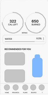
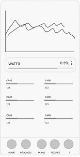
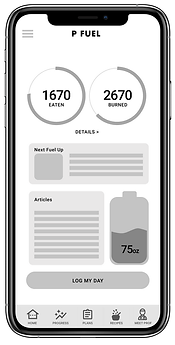
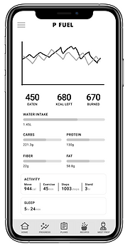
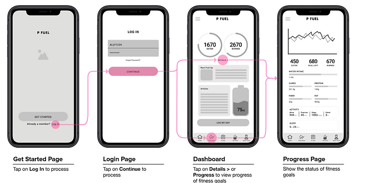
• A dashboard with charts where users can see their calories burned and their calories consumed.
• A water intake tracking feature.
• A graph tracking the progress through days/weeks.
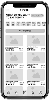
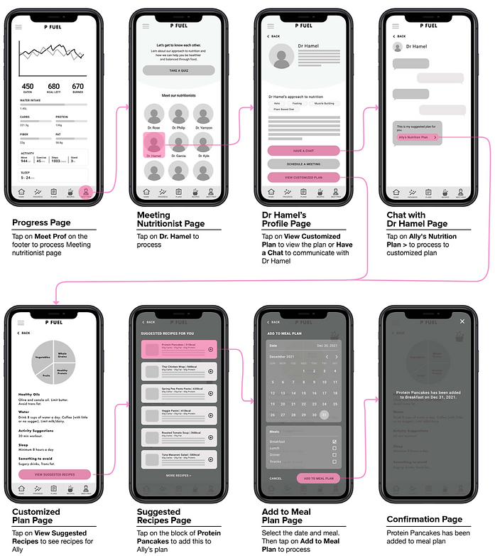
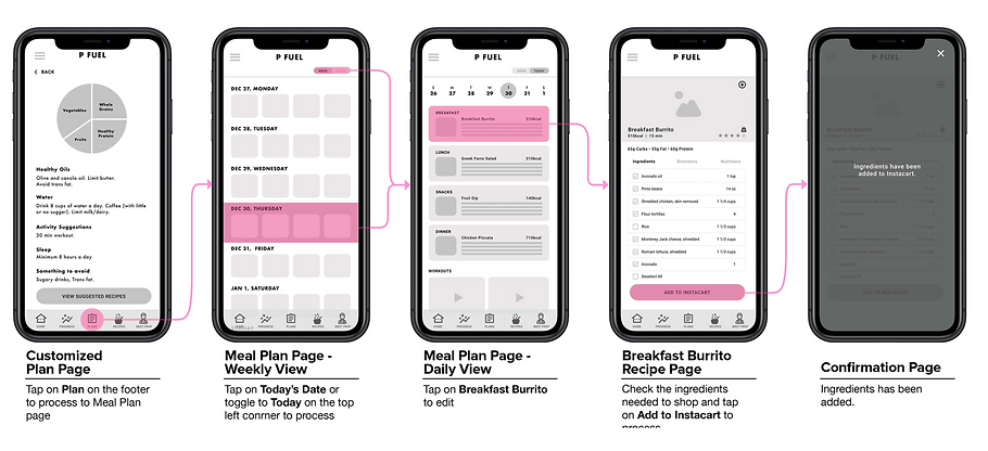
• Meal suggestion pages & recipe tutorials.
• Daily tracking of food (breakfast, Lunch, Dinner).
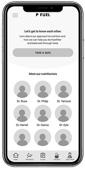
• A feature that allows users to contact and message a licenced nutritionist.
Low Fidelity - Mid Fidelity Mockups
In our design studio session our team decided to use figjam in order to share all of our ideas to our teammates. The first round of
design lasted 20 mins, we made low-fidelity designs of what we thought each feature’s layout should look like. After the time to design
our low fidelity mockups was up we had to pitch our designs to our teammates, our teammates in return gave us feedback about each
design. Our next step was to iterate our designs and add things we saw from our teammates’ work, this second round of designing was
much shorter. Afterwards we conducted a dot voting session to vote on our final designs best feature. Each team member was given
eight dots and they placed these dots on each feature that they thought was a good design for our final mid fidelity mockup.
Low Fidelity Mockup
Mid fidelity Mockup
After consolidating our design ideas via Design Studio, we implemented our final design in Figma to digitize our wireframe. We created
a mid-fidelity wireframe to show the limited functionality without any design aesthetics. It allows for a quick and easy way to test the
layout and design with users. A mid-fidelity prototype is a schematic illustration of the interfaces used to demonstrate the allocation of the content and functional elements on the interface. It is easier for stakeholders to visualize and communicate how elements on the interface are related.
Initial User Testing: First Round
Our team has designed a clickable prototype, or preview of our product, and began testing it with 5 different participants. On average, users spent a total of 3–5 minutes completing the tasks given with the scenarios we created. A scenario is used as background information needed for participants to get an understanding of where Ally’s role lies. With the four scenarios, we gave users four tasks total to complete.
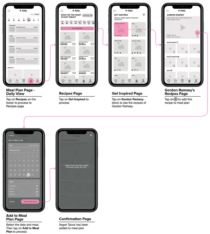
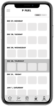
After testing our mid-fidelity designs with 5 different users we saw a 100% direct success rate during the first 2 tasks. In the third and fourth tasks however we saw different results. During the third task we saw 90% of participants had an easy time navigating through the app, only one user had trouble navigating through the mid fi but still managed to complete the task. Users completed the task in 21.75s with an easiness rating of 4.6 — getting confused by the difference between the recipes tab and the plans tab. During the fourth task we saw 80% of participants finished the task directly. Users had a difficult time trying to figure out where they would find Gordon Ramsey recipes. The “get inspired” button wasn’t registering with users. But in the end all users managed to finish thetask. It took users 29.01s to finish the task, with a 4.4 easiness rating. Our recommendation was to remove the “get inspired” button and just have a list of celebrity chefs on the “Recipes” page.